
In ecommerce, standing out is everything. Visual marketing can transform your online store from just another site into a memorable brand experience. Unfortunately, many underestimate the power of visual marketing. Often, people think it’s just about visuals and aesthetics.
But visual marketing goes beyond pretty pictures. It’s about tapping into the power of consumer psychology and creating a visually appealing experience that resonates with your target audience.
When done right, this can help transform your brand identity and create a bigger impact on your buyer journey. From social media posts to your website’s visual content, every piece helps tell your story and keep your audience engaged. This blog covers how to use visual marketing to captivate your audience and boost sales.
Understanding Visual Merchandising
Visual elements significantly impact consumer psychology, influencing decisions and building connections. According to a 2023 study published by MDPI, 85% of customers cite color as the primary reason for choosing a product. This underscores how crucial color is in shaping consumer behavior and highlights the importance of visual appeal in marketing strategies.
But visual merchandising isn’t just about looking good. It’s about creating an environment that attracts and retains customers. It’s a strategic marketing technique that blends different psychological principles to influence consumer behavior and enhance the overall shopping experience of your potential buyers.
Here are some key consumer psychology elements involved in visual merchandising:
Attention and Perception
- Color Psychology: Different colors evoke different reactions and emotions. For example, red can create a sense of urgency, while blue can instill trust, calm, and luxury.
Visual Hierarchy: Organizing web content to guide the eye from most important to least important. This can be achieved through size, color contrast, and placement.
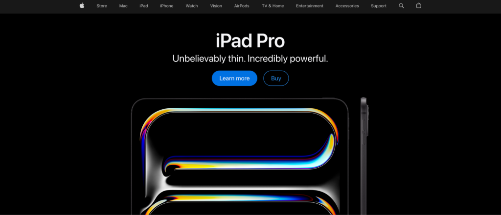
Top tip: Use Pixc’s Visual Merchandising app to take advantage of hierarchy and color psychology on your Shopify store.
- Imagery and Graphics: High-quality images and engaging graphics can capture attention and communicate product details effectively.
Emotion and Connection:
- Storytelling: Crafting a narrative around products can create an emotional connection with customers, making the products more memorable and desirable.
- Brand Identity: Consistent visual elements that reflect the brand’s personality help build a relationship with the customer, fostering loyalty.
Cognitive Load:
- Simplicity: Simplified designs reduce cognitive load, making it easier for customers to process information and make decisions.
- Clarity: Clear and concise information helps avoid confusion, increasing the likelihood of purchase.
Trust and Credibility:
- Social Proof: Displaying reviews, ratings, and testimonials can enhance credibility and trustworthiness.
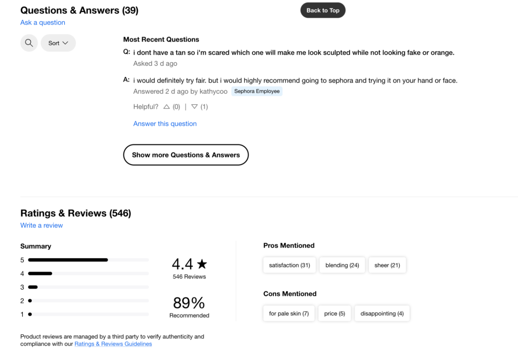
- Consistency: Consistent use of colors, fonts, and layouts builds trust by creating a familiar and professional appearance.
Decision Making:
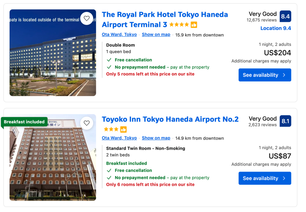
- Scarcity and Urgency: Techniques like limited-time offers or low stock indicators can create a sense of urgency, prompting quicker purchasing decisions. For example, Booking.com uses scarcity messages like “Only 2 rooms left” and urgency cues like deal countdown timers.
- Anchoring: Displaying higher-priced items alongside mid-range products can make the latter seem more affordable, guiding customers toward a purchase. Williams Sonoma does this well by displaying premium and standard models side-by-side to influence purchase decisions.
Personalization:
- Recommendations: Personalized product recommendations based on browsing history and preferences can enhance the shopping experience and increase sales. Do you know how Netflix suggests shows and movies tailored to individual viewing habits? Yes, that’s how they leverage visual marketing for their brand.
- Tailored Content: Customizing content to match individual customer preferences and behaviors makes the shopping experience more relevant and engaging.
Usability and Navigation:
- Ease of Navigation: Simple and intuitive navigation ensures that customers can find what they are looking for quickly and easily. Wayfair utilizes user-friendly filters and search options to help customers quickly find what they want.
- Responsive Design: Ensuring the website is optimized for all devices improves user experience and reduces bounce rates.
The Foundations of Visual Merchandising in Ecommerce
Many popular brands leverage different consumer psychology principles, specifically visual merchandising, to create that everlasting consumer experience. But you don’t need an expensive marketing campaign to take advantage of this.
You can start by understanding the basics of mastering visual marketing. Let’s dive into the essential principles and techniques that lay the groundwork for effective visual merchandising.
Understanding Your Brand’s Visual Identity
Let’s take a step back for a second. Think of Tiffany & Co, Apple.com, Spotify, or Amazon. Chances are, you already have a visual cue of what these brands are about the moment you think about them. That’s the power of brand identity.
Consistency and uniqueness help customers recognize your brand across all platforms. Before you can leverage visual merchandising, you first need to have a clear view of your own brand identity. Define your brand’s visual style with elements like color schemes, fonts, and imagery.
Once you’re set on this brand identity, use this all over your platforms. This builds trust and makes your brand memorable. Ensure that every visual element reflects your brand’s values and personality. Consistency doesn’t mean monotony; innovate within your brand’s boundaries for seasonal themes and promotions.
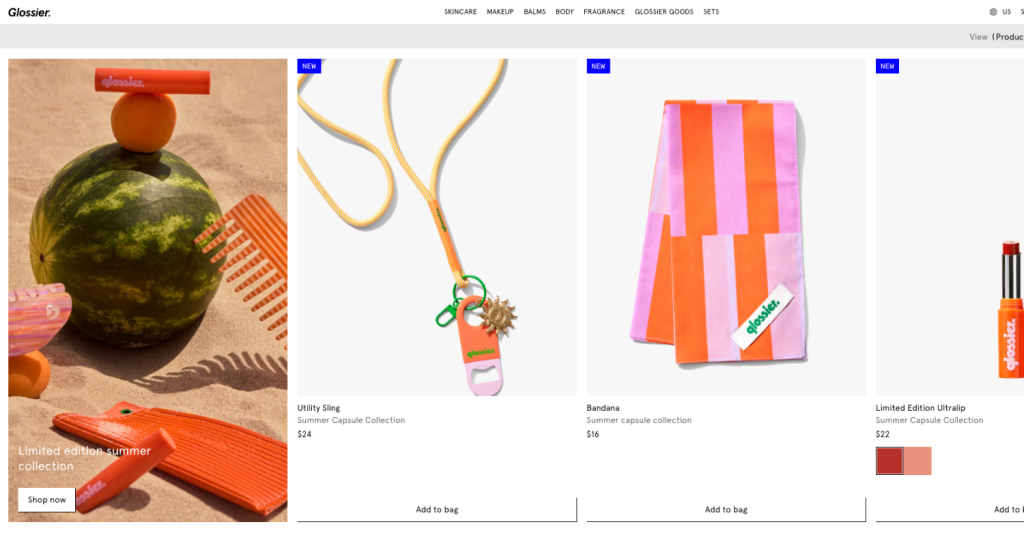
Glossier’s homepage is a masterclass in visual merchandising and brand identity. Bright, high-resolution images showcase their products beautifully, and the clean, chic design with ample white space makes everything pop.
Storyboarding Your Customer Journey
Visual marketing is not just about aesthetics, it’s about functionality, too. Organized product categories and strategic use of color enhance the user experience and drive higher conversion rates. For instance, using graphic design to highlight special offers or new arrivals can draw attention where it’s needed most.
Each visual element should serve a purpose, from guiding users through the buyer journey to making the checkout process seamless. This not only keeps customers engaged but also encourages them to make a purchase.
Mapping out visual touchpoints throughout the customer journey is key. Storyboarding helps visualize customer interactions. Identify key moments where visuals can enhance the experience, like high-quality images on product pages and engaging banners on landing pages. Effective storyboarding ensures a smooth and visually appealing journey for your customers.
- Awareness: Use captivating visuals on your homepage and social media to grab attention.
- Consideration: Use detailed product images, 360-degree views, and comparison charts.
- Conversion: Encourage purchase with clear visuals, enticing banners, and trust badges.
- Retention: Keep customers coming back with personalized visuals, follow-up emails, and retargeting ads.
Carefully plan and execute each visual touchpoint to ensure a seamless and engaging customer experience.
Crafting Your Visual Merchandising Strategy: The Essentials
Creating a winning visual merchandising strategy is about telling your brand’s story and engaging your target audience. Let’s break down the key components of an effective visual merchandising strategy and how to use it for your brand.
The Art of Stellar Product Photography
Great product photography is essential. High-quality images do more than showcase your products—they tell a story and sell a dream. Use good lighting, a clean background, and a consistent style to make your products pop.
Show your products in use to help customers visualize them in their lives. Incorporate video content to enhance the shopping experience and use user-generated content to build trust.
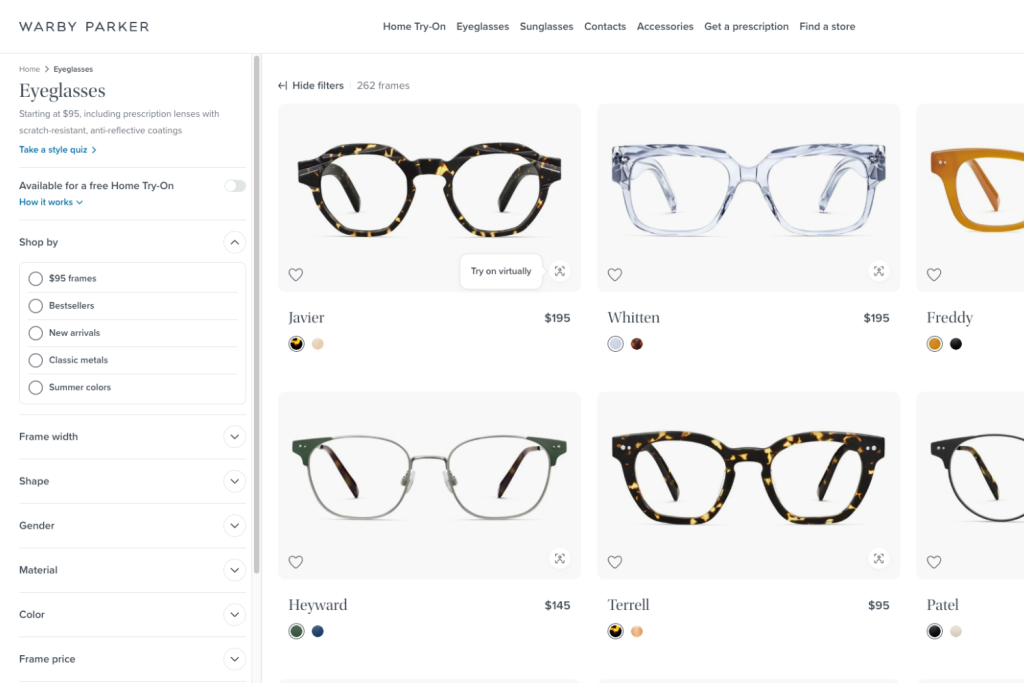
A great example of this is Warby Parker’s product photography. They use high-resolution photos and a consistent style to showcase their eyewear professionally. Images of people wearing the glasses help customers visualize them in real life, while simple backgrounds keep the focus on the products. Adopting these strategies can make your ecommerce store visually appealing and engaging.
Strategic Product Placement: The Blueprint to Engagement
Effective product placement maximizes visibility and attractiveness. Highlight bestsellers and new arrivals prominently. Use clean, organized sections to make it easy for shoppers to find what they need. Eye-catching banners and highlighted promotions keep your audience engaged.
Strategic placement is about functionality—guiding customers through a seamless shopping journey and encouraging purchases.
Utilizing Space: Layout and Design Principles
The layout of your online store matters. Clean and intuitive designs improve user experience. Focus on easy navigation and product accessibility. Arrange products in a way that makes them easy to find. Use whitespace effectively to avoid clutter and draw attention to key items. A well-organized layout can lead to higher engagement and conversions.
Pixc’s Visual Merchandising app combines the power of color psychology and product accessibility. It allows you to easily group your products together in an aesthetically pleasing manner by using color psychology, easily capturing your potential customers’ attention.
Speaking in Colors: Crafting Your Store’s Visual Language
Color plays a powerful role in visual merchandising. The psychology of colors can evoke emotions and create connections with shoppers. Warm colors like red create urgency, while cool tones like blue evoke calm and trust. Choose a palette that reflects your brand’s personality and appeals to your target audience.
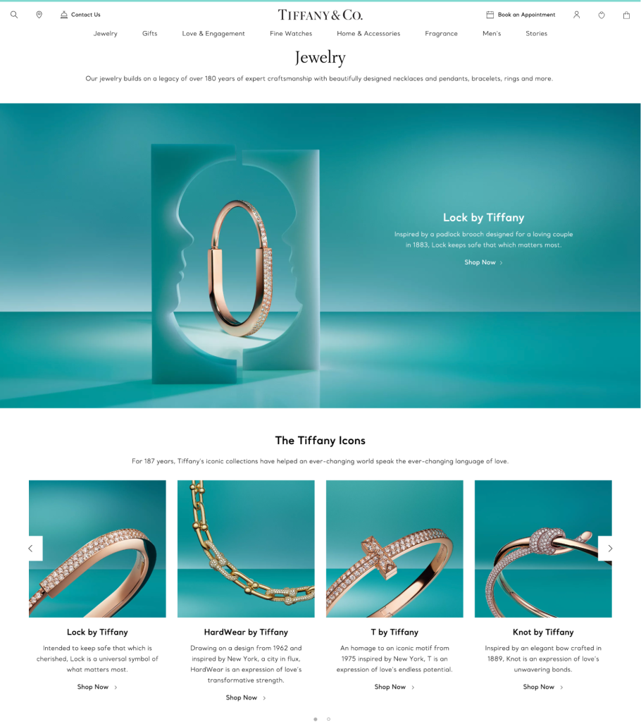
A perfect example is how Tiffany & Co. embodied that iconic blue color and elegant design elements that reflect luxury and timeless elegance.
Use contrasting colors for call-to-action buttons to make them stand out. Just how Amazon uses a combination of orange for call-to-action buttons to evoke a sense of urgency and blue for trust and reliability. A well-crafted color strategy makes your store visually appealing and guides customers through the buyer journey, enhancing their shopping experience.
Dynamic Visual Content: Videos and Animations
Dynamic content can bring your products to life. Videos are excellent for product demonstrations, showing the product in action and helping customers understand its features and benefits. Animations can also enhance the user experience. Use them sparingly to avoid slowing down your site. For example, an animated “add to cart” button can make the shopping experience more engaging and interactive.
Data-Driven Visual Merchandising
Leverage data and analytics to optimize your visual merchandising efforts. This will help you understand what works and what doesn’t.
Analyzing Visual Performance Metrics
Tracking visual content performance is crucial for optimizing your strategies. Focus on these key metrics:
- Click-Through Rates (CTR): Measures the percentage of users who click on your visual content, indicating its appeal.
- Conversion Rates: Tracks the percentage of users who complete desired actions, showing visual effectiveness in driving sales.
- Time Spent on Page: Assesses user engagement with visual content; longer times suggest higher interest.
- Bounce Rates: Indicates the percentage of users who leave without interacting; lower rates mean better engagement.
- Heatmaps: Tools like Hotjar show where users click, highlighting the most engaging visual elements.
Tools like Google Analytics and Hotjar are essential for tracking these metrics. Google Analytics provides comprehensive data on CTR, conversion rates, time on page, and bounce rates, while Hotjar offers heatmaps and session recordings to visualize user interactions.
Refine your strategies by identifying top-performing visuals and analyzing their common elements. Use this data to understand why certain visuals work better, and apply these insights to enhance your visual marketing strategies, ensuring continuous optimization for better engagement and conversion.
A/B Testing Visual Elements
A/B testing is a powerful method for optimizing visual elements. Test different versions of images, videos, and layouts to determine which performs better. For example, experiment with different product image angles or banner designs. Track the results and implement the winning elements. A/B testing enables data-driven decisions to enhance your visual merchandising.
Final thoughts
Visual marketing can transform your ecommerce store into a standout brand experience. You captivate your audience and drive sales by using eye-catching visuals and strategic placement. Master these principles, and your ecommerce store will shine in the crowded online marketplace.
Holly Cardew
