
Creating an intuitive ecommerce website is more than just pixels and code — it’s about orchestrating a shopping experience that your customers love because it’s so easy. Let’s look at some ecommerce UX best practices and tricks that bridge the gap between user expectations and a website’s functionality. Designing an intuitive website is basically all about user experience, which should come through in the creation process.
Why user experience matters for ecommerce brands
User experience is at the heart of successful ecommerce brands. These brands have a strong understanding of their target audience, what they want, and what motivates them – and that filters through to how their website’s designed.
User experience encompasses the entirety of a customer’s journey: from the moment they land on a website to their final checkout. The intuitive navigation swiftly guides users to desired products, the seamless checkout process minimizes friction, and the responsive design adapts to their device.
Ecommerce brands prioritizing user experience understand it’s not just about selling products. It’s about creating a personalized, trustworthy, and effortless environment — a digital space where customers feel valued and understood.
How intuitive design makes the user experience better
Positive user experiences create loyalty and brand advocacy. Customers are more likely to return when they encounter an ecommerce platform that prioritizes their needs and gives precise, clear info, easy-to-navigate layouts, and straightforward transactions.
Satisfied customers often become brand advocates and spread the word through reviews, social shares, and recommendations.
Intuitive design improves user experience by enhancing clarity and making navigation easier. It anticipates user needs and balances them with functionality—like menus, buttons, and essential info—where users naturally expect to find them. It reduces frustration, enabling users to navigate the website effortlessly without feeling lost or overwhelmed by excessive complexity.
Removing unnecessary steps and logically presenting information minimizes confusion, meaning users can make informed decisions swiftly. This user-centric approach enhances confidence and encourages engagement, creating an environment where users feel more comfortable and inclined to explore.
Ecommerce UX Best Practices to Plan and Design an Intuitive Ecommerce Website
Designing intuitive ecommerce websites ensures visitors can easily browse and buy what they want. From planning how users move around your site to ensuring everything looks good and works well, there are some essential ecommerce UX best practices to make your site a smooth and welcoming place for shoppers.
Know your audience
Understanding your audience is vital to tailoring your ecommerce site effectively. You can start by creating buyer personas—detailed profiles representing your customers.
Consider their preferences, behaviors, and needs. Tailor your website design, content, and features to align with these personas. Understanding your audience allows you to create a website that resonates and drives engagement.
Streamlined navigation
A user-friendly website structure is crucial for seamless navigation. Organize your site logically, using clear menus and categories. Search functionality that works is equally important, allowing users to find products effortlessly.
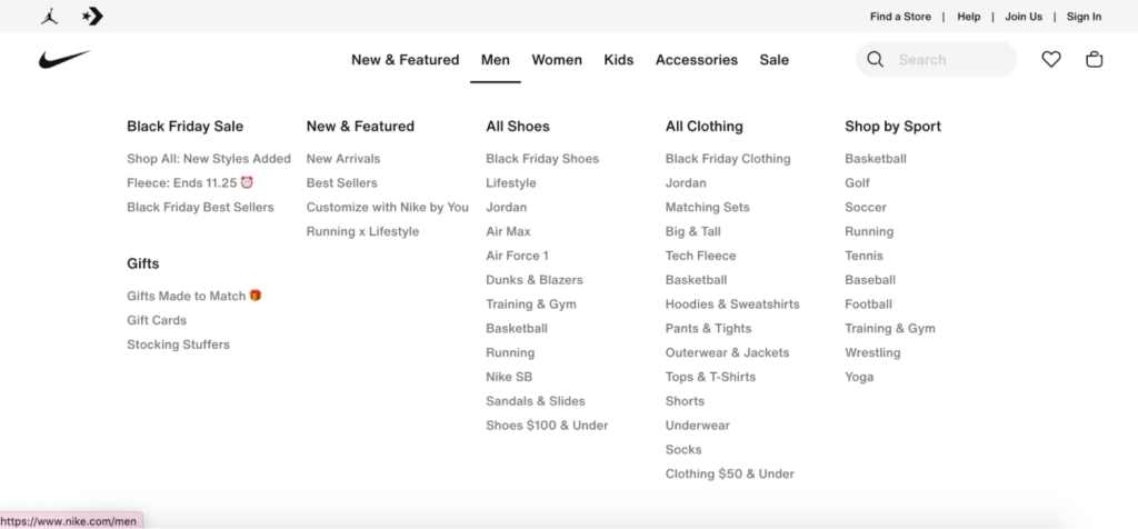
Simplifying the path to what users are looking for reduces frustration and encourages exploration – if it’s easier to find, they’re more likely to add it to their cart.
Mobile responsiveness
With more shoppers using mobile devices, optimizing for mobile is paramount. Designing for different screen sizes and ensuring your website works on a mobile device guarantees consistent and enjoyable shopping.
Incorporating mobile optimization best practices ensures your website looks and works great on smartphones and tablets – with no loss of functionality or anything weird happening.
High-quality imagery and visuals
Visuals are a big deal in ecommerce, especially for new customers. Use high-quality images and videos to showcase products accurately. Guidelines for image quality and consistency maintain a professional appearance, so make sure your images are all the right size, quality, clarity, and consistency.
Our ecommerce photo editing tools can make all of the above easy. Features like zoom and 360-degree views offer customers a detailed look, enhancing their shopping experience.
Intuitive product pages
Product pages should provide comprehensive yet concise information. Well-structured descriptions, customer reviews, and prominent calls-to-action guide customers toward making informed purchase decisions. Clear and persuasive product presentations make the buying process easier.
Smooth checkout process
Simplify the checkout process to reduce cart abandonment. Provide options for guest checkout and offer multiple secure payment methods. A smooth and secure checkout experience encourages customers to complete their purchases swiftly. You can also use add-on tools to encourage purchases post-card abandonment.
User-friendly shopping cart
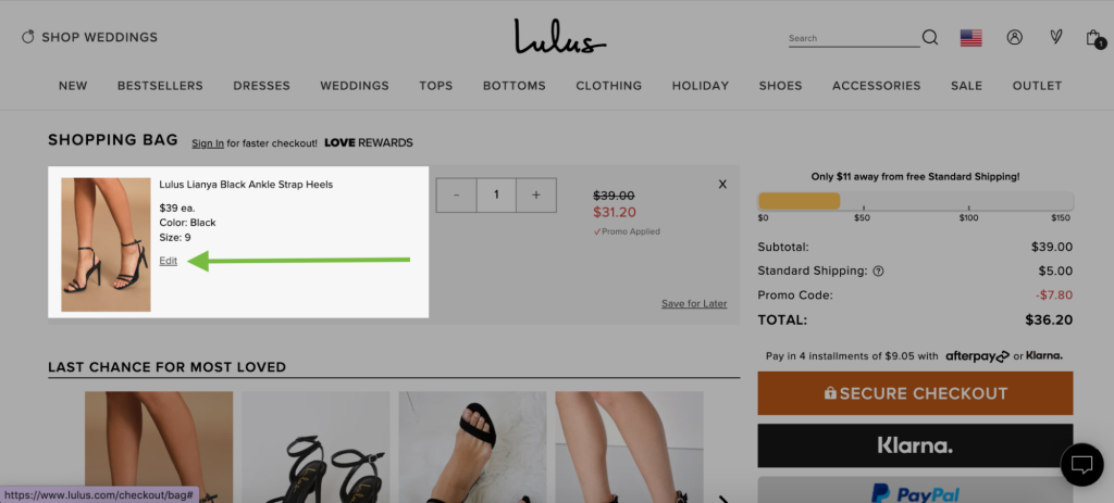
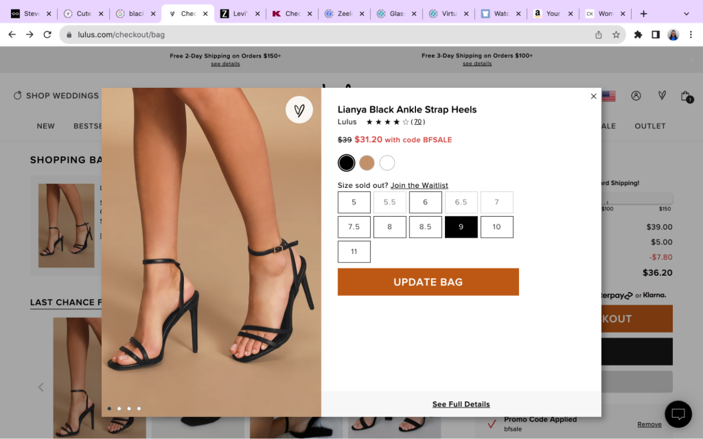
Make the shopping cart easy for customers to review and update their items so they don’t need to find shopping on your site complicated. Implement cross-selling and upselling strategies within the cart to increase order value. Display return policies prominently to reassure customers, too – it’s about being upfront and honest.
Personalization and recommendations
Leverage personalization by offering tailored product recommendations based on browsing and purchase history. Customize content to match user preferences, enhancing their experience and encouraging engagement. You can use third-party tools or plugins if your existing website needs to be set up for this.
Speed and performance
A fast-loading website is critical for retaining visitors. Reduce page load times and minimize website downtime to ensure a smooth and frustration-free shopping experience. If your page loads slowly, it might be time to reduce the size of images or info you have on your website or look at how it’s hosted and set up.
Accessibility and inclusivity
Ensure your website is accessible by complying with accessibility standards like Web Content Accessibility Guidelines (WCAG). Embracing inclusivity benefits users and enhances your brand’s reputation as a welcoming and accommodating platform.
Adding alt text to your imagery on your website can support accessibility and inclusivity—if you’re not sure where to start, you need the Pixc: Auto Alt Text tool to speed it up.
Testing and feedback
Conduct usability testing to identify issues and gather customer feedback to understand user preferences. Continuously iterate and improve your design based on this feedback, and utilize A/B testing to see what works best for most people – or different subsets of your audience.
Security and trust
Build trust by implementing robust security features such as SSL certificates and displaying trust seals prominently. Communicate privacy policies to reassure customers about their data security and confidentiality. Your site needs to feel legit, mainly if they’ve never visited you or you don’t have the brand awareness and recognition people seek.
Case Studies and Examples
Sometimes, examples are the best way to determine what you must do.
Here are some ecommerce brands doing their thing when creating an intuitive website that works for your customer.
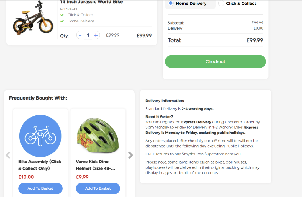
Smyths Toys uses personalization and product recommendations during the checkout process. This helps to increase order value and supports the customer without looking for other accessories they need to enhance their experience with everything they need.
Abbott Lyon
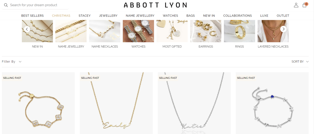
Jewelry store Abbott Lyon uses clean, high-quality product images to showcase their range of personalized jewelry. They also use easy-to-navigate categories throughout the site, making finding what you’re looking for straightforward. This is even more important with a brand with many similar products so customers don’t get overwhelmed.
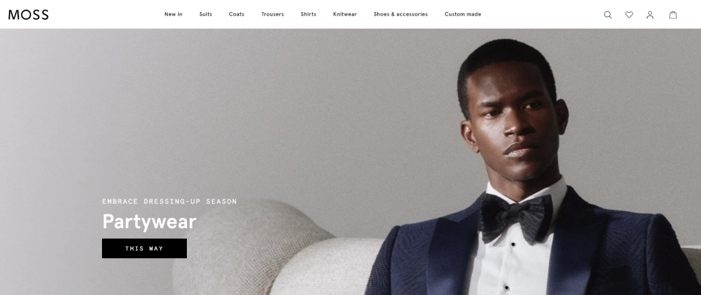
Moss
Men’s retailer Moss is another store that utilizes straightforward navigation, easy checkout, mobile responsiveness, and high-quality visuals that resonate with the target audience. They understand what their core audience is looking for when they visit the site, and they reflect that in their visuals.
Conclusion
In ecommerce, success comes from blending user experience with smart design. It’s about creating a website that speaks to customers, making them feel valued and understood from arrival until purchase.
Following these ecommerce UX best practices, like prioritizing user-friendly features, straightforward navigation, and hassle-free checkout, builds trust and keeps people returning. But it’s not a one-time job; it’s an ongoing commitment to fine-tune the site based on customers’ needs.
By focusing on accessibility, personalization, security, and adaptability, a great ecommerce site becomes a place where every click feels right and every visit is a positive experience.
Holly Cardew
